Post by Sean O'Pry on Feb 10, 2013 12:33:21 GMT -5
Hello Models!!!
Let's start the judging session for this round. Here are the photos.
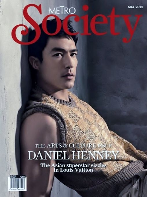
Andrew: This is a really good cover Daniel! The pose is nice, the face is strong... it feels gritty but in a fashionable way. It does look a little too photoshopped around the arm.. maybe its just weird lighting, but it looks a little too touched up. Good work this week! Continuing to impress us
Eugen: I already did this and then my browser crashed so I'm irritated lmfao But anyway, gorgeous face! Normally I hate the title going over someone's head but your face is just so gorgeous I dont' care! I hate the sweater vest though, ugly lol But gorgeous face <3
Rhys: You seem to impress me with every shoot. I love your pose and your outfit a lot here. The one thing that bothers me is the wording sort of blocking the top of youe head. If this was a normal pic i'd say it could have been used as sidekick.
Luke: I really like most of this photo. I love your posing along with your expression. Fits the vibe and color scheme well. However, like Eugen, I hate that sweater vest. Something's very off-putting about it, but at least it's only a small quarrel in an otherwise great cover.
Sean: I don't like your position in this photo but once again I love your sense of style. You looked good in everything, Daniel. The face is strong. Good job.

Andrew: Not really fond of the body position...but you do have a nice ass. I like the nice fitting suit, and your face is very modelesque... but its a tad boring... too many words all over the place, its almost distracting. Its good but not great. Good Luck Eddie!
Eugen: Not bad. Not great either. While the cover is busy, I like you on it. This might be the first time I've liked your face. Good job.
Rhys: I like the pose... it's great. I love your facial expression but the one thing i dont like is how busy the cover is. its distracting me from you!
Luke: What I like about this cover is that it's different. As a gay man, one would think the first place my eyes would go would have been to check out your butt since you're showing it off, but the first thing I noticed was actually your lack of socks. I don't want to be near you when you take those shoes off. Lack of socks aside, you're styled well for the type of magazine you're modeling for and it's a different enough cover that it'll win you some brownie points with me, but like the other judges, I think it's a little awkward and probably not your best shot.
Sean: I like this photo because it's different. The styling is very sleek and smart. I love the confident in this photo. You looked so tall here. I love it.
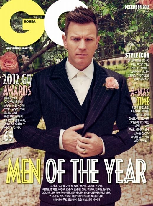
Eugen: You look so dapper in this. I like the variety you're giving us and this isn't bad. Very handsome. I only wish it didn't look like you were squinting. But other than that, not bad.
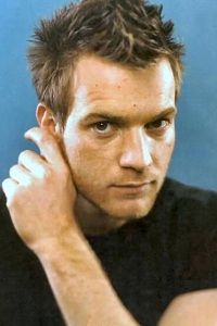
Andrew: VERY handsome Ewan... this is the sexy forty year old I was looking for! Love the hair and the attire. The face is a bit blank and the pose feels sort of stiff, but its still a great shot from you. Also love the whole flowery backdrop, and your little boutonniere (if thats what thats called lol). Good job this week Ewan
Rhys: Finally a photo from you that i actually like a lot! I love your facial expression... i dont even notice the words which is good because you are the center of my attention and thats what i like about this photo.
Luke: How very dapper. I love the styling and stance. While I like your face in this shot, I don't love it, but it's still good. Overall, I love the setting, too, but I'm not a big fan of the gate you're standing in front of. Would have liked it better if it were just the vegetation without the fence. However, my only problems with this cover are very minor. Overall, great work this week.
Sean: Definitely your best photo so far. Very smart and handsome. I love the style. The setting is very strong but it didn't distract my attention from you. Great job

Andrew: Another very sexy shoot Harry! Love the body... so goddamn hot haha.. especially that underwear! The face is a little weird and the pose makes me feel like you are a bit lost, but it showcases your muscles great. A clothed shot may have been better for this shoot, as last week was the time to go shirtless and whatnot... but I can't deny that I don't like this cover, because I love it. Good work again Harry! I just hope you don't rely on muscle photos all the time. We know you are packing
Eugen: I like your other Attitude cover more. Different expression and jeans. Your abs are nice, but I'm not wowed and holy mother of ..............your belly button is .................ewww......... sorry. Ok, moving past that. I do like this, but not in love with it, but again, way better than your first round.
Rhys: I like this one a lot. YOu've been stepping up your game so far which i also like. I didnt even notice the underwear right away and loved it but that makes it all the better to look at. I love your facial expression and how it matches the title very well.
Luke: It's like Sexy week and Magazine Cover week got together and had a baby. The magazine says it's a gay magazine and I'm sure gay guys would love this cover. I know I do. Your muscles are shown off in a really great way here. Like Andrew, I do have to concede that last round was the one where you got to strip down and be all sexy for us, so a shot with more clothing probably would have gone over better this round. However, doesn't mean I don't still like this shot
Sean: Gorgeous and sexy. The focus is on you. I love your eyes connection. Very strong. I don't know which one is more sexier in this photo. Either your eyes, body or your abs... Great job.

Luke: I normally like to wait until all photos are in before I critique so that I'm in the same frame of mind for all shots when I judge them. However, I don't feel the need to wait on this one. This is probably your best photo this Cycle. It's probably better than any photo you've submitted in the last Cycle, either (I wasn't around for the one before that). I love the way you're styled for this photo and couple that with your pose and you have a fantastic vibe for this shot. I completely agree with your description: this is a simple shot, but it says a lot.
Eugen: I really like this a lot!! I agree with Luke, it's your best in two cycles for sure! Also, I really love that you have given us three different looks within three different shoots. I love variety and you have that. This is sexy and shows just how handsome you are. Love the clean shaven Jamie so much <3
Andrew: I love this cover Jamie! Very simple and elegant. The colours really bring out your blue eyes, and you look very relaxed. I like your facial expression, but you could work on your pose. Almost feels like a slouch. Good work this week!
Rhys: Thsi is very plain but in a good way... your facial expression is very sexy and pulls me into your face. Nothing too distracting at all.
Sean: I think you looked a little bit boring in this photo. I don't feel any connection with this photo. You need to work more on your expression. I kinda like you with the beard actually.

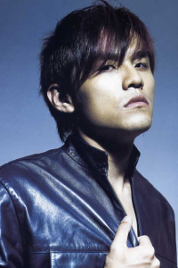
Andrew: OMG this is amazing! You did not make this... i don't believe it! Very impressive work Jay. The pink looks surprisingly really good on you! Love the pose with the Mic. I would've liked for your mouth to look a little different... like a big smile or something haha... it looks like you are blowing the mic. Other than that, very professionally done... fantastic job Jay!
Eugen: I really like this!!! A lot!!!! Love a new vibe from you, the energy in this shot, the quirkiness of it all. The singing, looking like an Asian Elvis! Very good job!!! OMG I just read the cover lol I know who you are now
Rhys: I almost didnt like this but then i saw that you made it yourself and i decided that It was super great because you made it. I dont like your face but your pose is really great!
Luke: Had this shot been for any cover other than Harper's Bazaar, I'm not sure I would have really liked it. However, it was the perfect magazine to make this the cover of. Since you did make it yourself, I do feel more comfortable talking about some of the technical issues I have with the cover. Some of the spacing between your lines of text is too large. The biggest offender is your actual name on the cover. There's far too much space between your first and last name. However, spacing issues aside, this is a great cover. Love the suit (not something I would ever wear myself, but I still love it) and the pose is great. It's actually a little reminiscent of Elvis for me. Making your own cover is difficult, but you did a great job with it this week.
Sean: I can't find any single thing that I don't like about this photo. Brilliant photo, very creative and the styling is fabulous. Love this!!!

Andrew: Still got that ugly hair, but you look very hunky here... you bulked up haha You almost look doll-like (i.e. too touched up) in this photo, and i'm not sure thats the way you should model. I like the facial expression, but everything else is pretty boring. Good luck Juan!
Eugen: *faints* Your face and chest are amazing!! And while you have that hair, it's styled a bit different and the lighting of the photo darkens it a bit so it's not distracting. I really like this shot. And after a quick search I'm very pleased with your selection <3
Rhys: I really like this picture. I think you had an upgrade from last week. Your face and your body is great.
Luke: As I said before in my warning in the Photoshoot thread: if you post a spread instead of a cover, I will search for any covers you may have and if you used a spread over a good cover, I would take points off for that. However, I only really found 1 cover of you and it sucked, so good decision in going with the spread. This is actually the best you've looked in a shot so far and I love the overall styling and vibe of the shot. I do want to caution you about your angles, though. So far, there have been three shoots and all three shoots, you're giving us the same angles in your posing. I would like to see you change it up in the future and give us a big more variety. Other than that, good shot this week. Oh, and I vehemently disagree with Andrew about your hair this week. While it is very similar to the hair I hated last week, it actually looks good on you in this shot.
Sean: I don't like the shirt. Not a fan of the necklace either. But you looked so damn fine in this photo. The angle is so much better this week. I love the improvement and nice hairstyle!!!

Andrew: I love this Logan! Strong pose and facial expressions. The green jacket surprisingly looks really good and I love the whole diner backdrop. I don't really have any complaints for this cover except for the hair... not really fond of the flat beiber short cut... your gif and avatar have much better hair imo. Still, a job well done! You boys are making this round very hard to judge... so many great shots! Good Luck!
Eugen: Yay, I don't feel so dirty anymore. You look your age here and it's a lovely photo. I love your pose and styling. I like your connection with the camera, it's intense. I'm very pleased to say, you look mature. !! Good job!
Rhys: You are making me fall for you.... this is great you look so mature in this. Your eyes are so pretty and other then the yucky green jacket i like everything about this photo.
Luke: I'm brewing some coffee if you would like some. You look like you're about to fall asleep here. Still, I find myself liking the pose, anyway. I'm with Rhys in not really liking that jacket, but that's mainly just a personal color problem. Your eyes are very pretty here and this is a really polished shot, so that works in your favor, too.
Sean: This is definitely my favorite photo from you so far. I love your eyes. Very sexy. I love the concept of this cover. Very sexy and smooth and I love your styling this week especially that blazer. You looked good in that blazer.

Andrew: I knew you would be very limited this week, so a website advert is acceptable in my opinion. Unfortunately its just really boring. You look hot and got a great smile, but I don't see a model here... sorry. Good luck Marcus!
Eugen: I agree it's acceptable but I also agree it's boring and not really helping you this week While your smile is good here, I'm not loving the nose and eyes, might be the angle but I'm not finding you attractive this week.
  Glorious abs though.
Rhys: All i see is a great body and a cheesy smile... I just going to agree with all the others
Luke: Yeah, this is definitely not your week. You showed us last week that you can and will have moments of brilliance in this competition, but you can't help not having any usable covers or spreads. Your only real option this week would have been to create something. While you look good from the neck down in this photo, your face is just really off-putting in this shot. I'm also not liking the overall styling of the shot. Here's to hoping that next week has something that suits you better.
Sean: The smile is very awkward and uncomfortable to look. The background color make this shot look so cheap. The only thing that I like about this photo is your six pack, Marcus

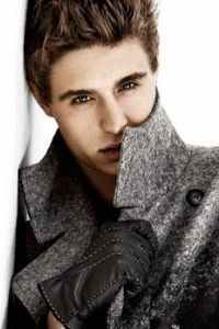
Eugen: This is good. I like the styling, the setting. Everything works. Except your mouth, but it's probably due to head positioning while on a bike lol So I don't hate it. You look so debonair, and like Jamie, you've shown three different sides to you through styling and I like that.
Andrew: Love this photo... always liked clean action shots. Your outfit is very spiffy and you look really hot (again lol)... I agree with Eugen about how the mouth could be better. The concept is all very good and It makes me want to pick up the issue. I feel the lighting could be a bit darker.. almost feels slightly faded... Still, another great shot from you! Keep it up
Rhys: You are deff one of my most favorite models in this game and you've impressed me every week so far. I have nothing bad to say.
Luke: The slightly agape mouth is a little off, but otherwise, love the pose, love the styling, love the setting, love almost everything about this shot. The lighting could be a bit better, but that's a small price to pay for a cover that's otherwise great.
Sean: I don't like the lighting. But the concept and the style is so dashing and charming. I love the bicycle, scarf and also the jacket. Very modelesque and your face is strong too. Another solid photo from you, Max

Andrew: Really like this RDJ!! great improvement over the last 2 weeks... very simple and elegant. The 50 shades of grey is really workin in this shoot haha A very angelic face thats half sweet and half serious. It may be too simple for my liking, but Its really well done and you are featured beautifully. Great work this week RDJ!
Eugen: BRAVO!!! This is your best photo yet!!! Sexy and pulls me in! I love your connection with the camera and your styling is classy and gorgeous!! Great job!!!
Rhys: Like i said to another model there is so much going on at once but im loving your face. I'd love to say i like your outfit but all the words are blocking it.
Luke: This is definitely the best shot you've given us so far in the competition. You look fantastic in that suit and this is just a nice, straight-forward cover. It could be viewed as being a bit too safe, but sometimes a straight-forward shot is all you need.
Sean: You still can work on your expression. A little bit blank for me but I love your improvement. You're getting better and the styling is great. Good job. I want to see more photos from you.
Let's start the judging session for this round. Here are the photos.

Andrew: This is a really good cover Daniel! The pose is nice, the face is strong... it feels gritty but in a fashionable way. It does look a little too photoshopped around the arm.. maybe its just weird lighting, but it looks a little too touched up. Good work this week! Continuing to impress us
Eugen: I already did this and then my browser crashed so I'm irritated lmfao But anyway, gorgeous face! Normally I hate the title going over someone's head but your face is just so gorgeous I dont' care! I hate the sweater vest though, ugly lol But gorgeous face <3
Rhys: You seem to impress me with every shoot. I love your pose and your outfit a lot here. The one thing that bothers me is the wording sort of blocking the top of youe head. If this was a normal pic i'd say it could have been used as sidekick.
Luke: I really like most of this photo. I love your posing along with your expression. Fits the vibe and color scheme well. However, like Eugen, I hate that sweater vest. Something's very off-putting about it, but at least it's only a small quarrel in an otherwise great cover.
Sean: I don't like your position in this photo but once again I love your sense of style. You looked good in everything, Daniel. The face is strong. Good job.

Andrew: Not really fond of the body position...but you do have a nice ass. I like the nice fitting suit, and your face is very modelesque... but its a tad boring... too many words all over the place, its almost distracting. Its good but not great. Good Luck Eddie!
Eugen: Not bad. Not great either. While the cover is busy, I like you on it. This might be the first time I've liked your face. Good job.
Rhys: I like the pose... it's great. I love your facial expression but the one thing i dont like is how busy the cover is. its distracting me from you!
Luke: What I like about this cover is that it's different. As a gay man, one would think the first place my eyes would go would have been to check out your butt since you're showing it off, but the first thing I noticed was actually your lack of socks. I don't want to be near you when you take those shoes off. Lack of socks aside, you're styled well for the type of magazine you're modeling for and it's a different enough cover that it'll win you some brownie points with me, but like the other judges, I think it's a little awkward and probably not your best shot.
Sean: I like this photo because it's different. The styling is very sleek and smart. I love the confident in this photo. You looked so tall here. I love it.

Eugen: You look so dapper in this. I like the variety you're giving us and this isn't bad. Very handsome. I only wish it didn't look like you were squinting. But other than that, not bad.
Andrew: VERY handsome Ewan... this is the sexy forty year old I was looking for! Love the hair and the attire. The face is a bit blank and the pose feels sort of stiff, but its still a great shot from you. Also love the whole flowery backdrop, and your little boutonniere (if thats what thats called lol). Good job this week Ewan
Rhys: Finally a photo from you that i actually like a lot! I love your facial expression... i dont even notice the words which is good because you are the center of my attention and thats what i like about this photo.
Luke: How very dapper. I love the styling and stance. While I like your face in this shot, I don't love it, but it's still good. Overall, I love the setting, too, but I'm not a big fan of the gate you're standing in front of. Would have liked it better if it were just the vegetation without the fence. However, my only problems with this cover are very minor. Overall, great work this week.
Sean: Definitely your best photo so far. Very smart and handsome. I love the style. The setting is very strong but it didn't distract my attention from you. Great job

Andrew: Another very sexy shoot Harry! Love the body... so goddamn hot haha.. especially that underwear! The face is a little weird and the pose makes me feel like you are a bit lost, but it showcases your muscles great. A clothed shot may have been better for this shoot, as last week was the time to go shirtless and whatnot... but I can't deny that I don't like this cover, because I love it. Good work again Harry! I just hope you don't rely on muscle photos all the time. We know you are packing

Eugen: I like your other Attitude cover more. Different expression and jeans. Your abs are nice, but I'm not wowed and holy mother of ..............your belly button is .................ewww......... sorry. Ok, moving past that. I do like this, but not in love with it, but again, way better than your first round.
Rhys: I like this one a lot. YOu've been stepping up your game so far which i also like. I didnt even notice the underwear right away and loved it but that makes it all the better to look at. I love your facial expression and how it matches the title very well.
Luke: It's like Sexy week and Magazine Cover week got together and had a baby. The magazine says it's a gay magazine and I'm sure gay guys would love this cover. I know I do. Your muscles are shown off in a really great way here. Like Andrew, I do have to concede that last round was the one where you got to strip down and be all sexy for us, so a shot with more clothing probably would have gone over better this round. However, doesn't mean I don't still like this shot

Sean: Gorgeous and sexy. The focus is on you. I love your eyes connection. Very strong. I don't know which one is more sexier in this photo. Either your eyes, body or your abs... Great job.

Luke: I normally like to wait until all photos are in before I critique so that I'm in the same frame of mind for all shots when I judge them. However, I don't feel the need to wait on this one. This is probably your best photo this Cycle. It's probably better than any photo you've submitted in the last Cycle, either (I wasn't around for the one before that). I love the way you're styled for this photo and couple that with your pose and you have a fantastic vibe for this shot. I completely agree with your description: this is a simple shot, but it says a lot.
Eugen: I really like this a lot!! I agree with Luke, it's your best in two cycles for sure! Also, I really love that you have given us three different looks within three different shoots. I love variety and you have that. This is sexy and shows just how handsome you are. Love the clean shaven Jamie so much <3
Andrew: I love this cover Jamie! Very simple and elegant. The colours really bring out your blue eyes, and you look very relaxed. I like your facial expression, but you could work on your pose. Almost feels like a slouch. Good work this week!
Rhys: Thsi is very plain but in a good way... your facial expression is very sexy and pulls me into your face. Nothing too distracting at all.
Sean: I think you looked a little bit boring in this photo. I don't feel any connection with this photo. You need to work more on your expression. I kinda like you with the beard actually.

Andrew: OMG this is amazing! You did not make this... i don't believe it!
 Very impressive work Jay. The pink looks surprisingly really good on you! Love the pose with the Mic. I would've liked for your mouth to look a little different... like a big smile or something haha... it looks like you are blowing the mic. Other than that, very professionally done... fantastic job Jay!
 Eugen: I really like this!!! A lot!!!! Love a new vibe from you, the energy in this shot, the quirkiness of it all. The singing, looking like an Asian Elvis! Very good job!!! OMG I just read the cover lol I know who you are now

Rhys: I almost didnt like this but then i saw that you made it yourself and i decided that It was super great because you made it. I dont like your face but your pose is really great!
Luke: Had this shot been for any cover other than Harper's Bazaar, I'm not sure I would have really liked it. However, it was the perfect magazine to make this the cover of. Since you did make it yourself, I do feel more comfortable talking about some of the technical issues I have with the cover. Some of the spacing between your lines of text is too large. The biggest offender is your actual name on the cover. There's far too much space between your first and last name. However, spacing issues aside, this is a great cover. Love the suit (not something I would ever wear myself, but I still love it) and the pose is great. It's actually a little reminiscent of Elvis for me. Making your own cover is difficult, but you did a great job with it this week.
Sean: I can't find any single thing that I don't like about this photo. Brilliant photo, very creative and the styling is fabulous. Love this!!!

Andrew: Still got that ugly hair, but you look very hunky here... you bulked up haha You almost look doll-like (i.e. too touched up) in this photo, and i'm not sure thats the way you should model. I like the facial expression, but everything else is pretty boring. Good luck Juan!
Eugen: *faints* Your face and chest are amazing!! And while you have that hair, it's styled a bit different and the lighting of the photo darkens it a bit so it's not distracting. I really like this shot. And after a quick search I'm very pleased with your selection <3
Rhys: I really like this picture. I think you had an upgrade from last week. Your face and your body is great.
Luke: As I said before in my warning in the Photoshoot thread: if you post a spread instead of a cover, I will search for any covers you may have and if you used a spread over a good cover, I would take points off for that. However, I only really found 1 cover of you and it sucked, so good decision in going with the spread. This is actually the best you've looked in a shot so far and I love the overall styling and vibe of the shot. I do want to caution you about your angles, though. So far, there have been three shoots and all three shoots, you're giving us the same angles in your posing. I would like to see you change it up in the future and give us a big more variety. Other than that, good shot this week. Oh, and I vehemently disagree with Andrew about your hair this week. While it is very similar to the hair I hated last week, it actually looks good on you in this shot.
Sean: I don't like the shirt. Not a fan of the necklace either. But you looked so damn fine in this photo. The angle is so much better this week. I love the improvement and nice hairstyle!!!

Andrew: I love this Logan! Strong pose and facial expressions. The green jacket surprisingly looks really good and I love the whole diner backdrop. I don't really have any complaints for this cover except for the hair... not really fond of the flat beiber short cut... your gif and avatar have much better hair imo. Still, a job well done! You boys are making this round very hard to judge... so many great shots! Good Luck!
Eugen: Yay, I don't feel so dirty anymore. You look your age here and it's a lovely photo. I love your pose and styling. I like your connection with the camera, it's intense. I'm very pleased to say, you look mature. !! Good job!
Rhys: You are making me fall for you.... this is great you look so mature in this. Your eyes are so pretty and other then the yucky green jacket i like everything about this photo.
Luke: I'm brewing some coffee if you would like some. You look like you're about to fall asleep here. Still, I find myself liking the pose, anyway. I'm with Rhys in not really liking that jacket, but that's mainly just a personal color problem. Your eyes are very pretty here and this is a really polished shot, so that works in your favor, too.
Sean: This is definitely my favorite photo from you so far. I love your eyes. Very sexy. I love the concept of this cover. Very sexy and smooth and I love your styling this week especially that blazer. You looked good in that blazer.

Andrew: I knew you would be very limited this week, so a website advert is acceptable in my opinion. Unfortunately its just really boring. You look hot and got a great smile, but I don't see a model here... sorry. Good luck Marcus!
Eugen: I agree it's acceptable but I also agree it's boring and not really helping you this week
 While your smile is good here, I'm not loving the nose and eyes, might be the angle but I'm not finding you attractive this week.
  Glorious abs though.
 Rhys: All i see is a great body and a cheesy smile... I just going to agree with all the others
Luke: Yeah, this is definitely not your week. You showed us last week that you can and will have moments of brilliance in this competition, but you can't help not having any usable covers or spreads. Your only real option this week would have been to create something. While you look good from the neck down in this photo, your face is just really off-putting in this shot. I'm also not liking the overall styling of the shot. Here's to hoping that next week has something that suits you better.
Sean: The smile is very awkward and uncomfortable to look. The background color make this shot look so cheap. The only thing that I like about this photo is your six pack, Marcus

Eugen: This is good. I like the styling, the setting. Everything works. Except your mouth, but it's probably due to head positioning while on a bike lol So I don't hate it. You look so debonair, and like Jamie, you've shown three different sides to you through styling and I like that.
Andrew: Love this photo... always liked clean action shots. Your outfit is very spiffy and you look really hot (again lol)... I agree with Eugen about how the mouth could be better. The concept is all very good and It makes me want to pick up the issue. I feel the lighting could be a bit darker.. almost feels slightly faded... Still, another great shot from you! Keep it up
Rhys: You are deff one of my most favorite models in this game and you've impressed me every week so far. I have nothing bad to say.
Luke: The slightly agape mouth is a little off, but otherwise, love the pose, love the styling, love the setting, love almost everything about this shot. The lighting could be a bit better, but that's a small price to pay for a cover that's otherwise great.
Sean: I don't like the lighting. But the concept and the style is so dashing and charming. I love the bicycle, scarf and also the jacket. Very modelesque and your face is strong too. Another solid photo from you, Max

Andrew: Really like this RDJ!! great improvement over the last 2 weeks... very simple and elegant. The 50 shades of grey is really workin in this shoot haha A very angelic face thats half sweet and half serious. It may be too simple for my liking, but Its really well done and you are featured beautifully. Great work this week RDJ!
Eugen: BRAVO!!! This is your best photo yet!!! Sexy and pulls me in! I love your connection with the camera and your styling is classy and gorgeous!! Great job!!!
Rhys: Like i said to another model there is so much going on at once but im loving your face. I'd love to say i like your outfit but all the words are blocking it.
Luke: This is definitely the best shot you've given us so far in the competition. You look fantastic in that suit and this is just a nice, straight-forward cover. It could be viewed as being a bit too safe, but sometimes a straight-forward shot is all you need.
Sean: You still can work on your expression. A little bit blank for me but I love your improvement. You're getting better and the styling is great. Good job. I want to see more photos from you.



 thanks

