Post by Sean O'Pry on Feb 4, 2013 22:42:19 GMT -5
Hello Models!!!
Welcome to your First Elimination session. This week you need to submit a photo to represent the life in the city. Let's see the photos.
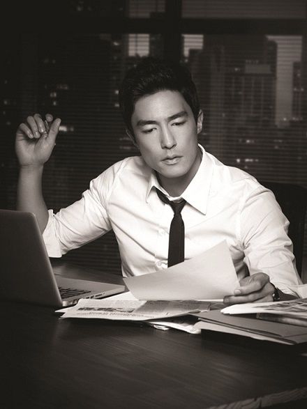
Rhys: hm i have very iffy feelings about this. Thanks for the description though. I love your look but i'm not fond of the city background.
Andrew: I actually love this Daniel! Its got a very sophisticated vibe going on. The city life definitely consists of busy office jobs... which are not fun! The B&W i could have done with out, but it does give the shot a cool effect. I do wish you were looking at the camera though as it would help give a better connection with the viewer. Other than those two things, I think you did a fine job with this weeks theme.
Eugen: I'm with Andrew on this one. I love the setting. Late night at work, the city scenery is obvious in the window. You look handsome and hard at work. Good job!!
Luke: Stuck working late? Yeah, that's reads City Life to me. I like how you looked engrossed in your task, but still dignified at the same time. You modeled well in this picture and did an even better job incorporating the theme.
Sean: I love this so much. I think you managed to portray the city life so well. I see a city man in you. Great execution. Even though you don't watch the camera, the connection with us viewers is still strong.

Eugen: The outfit, the briefcase, the styling all definitely say city man to me. I'm not fond of your expression but it's a minor complaint
Andrew: Love love love the outfit! the suit, umbrella, briefcase, and coat... def. a city boy. I do agree with Eugen about the expression... your mouth looks a little odd. lol Your pose on the other hand is great and shows off your slim bod. I wish there was a bit more background other than a white wall, but you really came through with the city look in your accessories. Good Job Eddie!
Rhys: I'm going to agree with Eugen here... your facial expression is a tad strange but i'm digging the outfit. Shows that your a classy business man going to work.
Luke: Despite the studio background, it's still easy to read City Life in this picture. Like the other judges, your face is a bit off-putting in this photo, but it's not terrible. I do really like your styling and accessorizing in this shot.
Sean: Agree with Luke that the background don't affect this photo at all. The styling is so strong. I love the combination of the accessories in this photo so much. Great job.

Andrew: I think this is great Ewan! I see we are back in your older days. Love the hair, the silly expression, and the body language. The motorcycle and buildings/cars all around you really bring out the city atmosphere. The photo is a tad on the blurry side but it's not terrible quality. Also, the B&W makes it feel very old fashioned so I don't know if that works entirely either... but I do like the effect, and the overall set works really well into this weeks theme. It would be nice for there to be no words in the corner, but honestly I don't mind. You took a great shot here Ewan. Good job!
Luke: This shot has grown on me. The facial expression made me have flashbacks to Jack Nicholson in The Shining, but other than that, I love the photo. Great styling, great pose, and great setting. I think that I like that it's in black and white as well. I'm picturing it in color and I feel like the black and white is adding character to the photo in this instance.
Eugen: I like this. The photo is a tad on the grainy side but not enough to bother me. I think the clothing choice is a throwback to the fifties so I think that the old fashion vibe is on purpose. I like your setting a lot. This is really good.
Sean: I got the 'James Dean' vibe from this photo. I love that you have so much fun in this photo. I like the concept. I think you need to be careful more with your expression but overall, I like this
Rhys: I agree with sean on the James Dean Vibe.... totally a great city vibe... one thing i dont like is your mouth it seem very awkward to me.
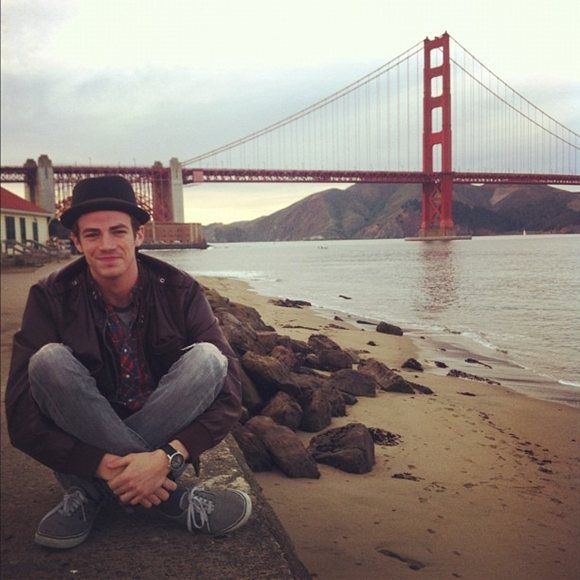
Andrew: This is a nice pic Grant! San Fran is surely a big city... I don't know if this represents city life though. More of a beach vibe especially with the attire. But, this is a great shot and i love the whole backdrop for what it is. The bridge does represent city in a way... I wish you gave a little description so we could've seen why you may have chosen this one over others. A tad candid but it works in this shot! Good Luck.
Rhys: So i'm a huge Grant Gustin fan and i really think this is a great picture. It's pretty simple but it'll get you through. It does look a tad candid like your best friend took it but i'm still a fan of it.
Eugen: I guess I can see city beach. That is a famous bridge so luckily for you, we know where it is. Your clothes do scream city kid to me so that's a plus. This is pretty good in a way, I don' see candid at all but I do get why the other guys see that. Nice try.
Luke: When it comes to your choice in attire, I'm going to have to side with Eugen on this one: it definitely reads city to me. Also, he was right that it's fortunate that's a famous bridge, so it does help us connect you to a city easier considering this is basically a beach shot. While it doesn't look candid to me, I am able to see why other judges might feel that way. Ya know, now that I've typed this out, I just realized I probably could have just copied and pasted Eugen's critique
Sean: I don't know what to say about this since my fellow judges already said what I want to say. All I can say is I like this. I love the simplicity in this photo. You looked like a very humble city boy here. I don't see a model here but I think you have the potential

Andrew: I don't want to sound harsh here Harry, but this is way too candid and not much modelling at all. The bag and suit fit the theme but I can't overlook the fact that this is a paparazzi shot and it just doesn't work. I know you as a model have a very limited selection, but i'm sure you could have done a lot better than this. You have potential in this competition, so I will keep that in mind when I do my ranking, but you are not off to a good start with this Harry. Good luck!
Rhys: Your face is drawing me in. I feel like your body and outfit fit the theme but everything around it does not. I guess the people could be like people in a city and the steps of a building but i have to try really hard
Luke: Yeah, this definitely looks candid to me. Had there not bee obvious passer-bys in the background, it could have been played off as being a modeling photo that happened to look candid, but the background surely suggests a candid shot. I'm not really a fan of your facial expression or you pose in this shot. The styling is nice and you definitely are in the city, so there are positive aspects of this photo.
Eugen: Yikes, this is candid. The outfit is great and I like the setting but it's not good to submit candid photos unless they can make us believe they are not. You have not done that here sorry.
Sean: Yeah candid is very risky. I think this is your first time here. So next time try to avoid candid shot unless we want you to submit one. I think the styling is definitely city. I love the attitude that you brought here. I hope we get to see you again.

Rhys: I really like you and i'm rooting for you but this photo seems a tad candid. Your face and smile is what catches my but the door is sort of blocking the city background and im trying to figure out whats in your hand.
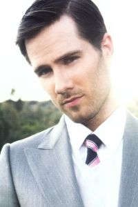
Andrew: haha I new that was a Guinness the moment I saw it. Love the irish.
I actually really like this shot Jamie! The cab, the suit, even the drink from the bar. I think this has got city boy all over it. The picture is a bit small which I can overlook, but larger would be nice.. it also feels cropped or cramped because the cab door is taking over the shot. lol The little bit of greenery also shows how there isnt much green in the city but there is some! I can see why Rhys sees it as a bit candid but I can see it as a modelling shot as well. Body language is good and the cheeky smirk is perfect. Good job Jamie!
Eugen: Jamie! You have a great advantage over the other guys. You're a model as well as an actor. I actually forgot you were the Sheriff from Once Upon A Time and when I saw your name I was like OH MODEL he's got this! lol
ANYWAY, I also knew that was a Guinness right away too and hey lets be real, it seems like a city beer to me lol I like this. I like the connection with the camera. I like your setting. You're dressed up and drinking beer, so city life imo. Good job!
Luke: I looked and didn't see any photos that were much larger than this one. The largest I found was probably about 15% larger than the one you submitted. Like Andrew, I would have prefered a larger shot to be able to see you better, but this one is fine enough as it is. That said, it's a nice shot. Doesn't feel candid to me, but I am able to see why Rhys feels it may be. I like the pose and the beer in your hand is a nice added touch. I don't think this photo will be memorable, but it's a nice way to start off the competition. It makes me optimistic that you will top your Justin Hartley performance.
Sean: Being a former model, I expected you to do better. This photo is okay. I got the city vibes, but the size should be better next time because it definitely help the opinion towards the photo
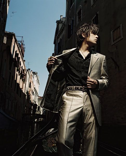
Rhys: By far my favorite. The coloring is amazing, the way the lighting reflects to make you stand out and slightly hits the building... gorgeous
Andrew: This is an awesome shot Jay! Very stylish. Concept and location are great. Venice is a beautiful city to shoot in. There are two things that bother me a bit though.. the lighting and the hair. I do wish the lighting was a bit brighter for this theme... its really hard to recognize where you are at first glance. I had no clue you were on a gondola, let alone Venice. lol The wet hair is also a tad unattractive... the way the light hits it makes it greasy looking. I love the suit and the pose though, so great job on that! Good luck!
Eugen: This is nice. I love the setting and the colouring. I'm not bothered by the lighting cuz I do find that my screen seems to be a bit better than most. Photos that look dark to a lot of people are just fine to me. My only issue is your hair, only ONLY because this is the first week and I don't know who you are, I'd love to see more of your face. BUT I love profile shots and you have a GORGEOUS profile!!! Also, great pose. Good job!
Luke: While your color scheme matches the coloring of the background, you still manage to pop out in this photo. I have absolutely no problem with profile shots. I know some people are sticklers for "I want to see your eyes," but profile shots are legitimate can when used in the right situation, much more powerful. This is one of those situations. Overall, definitely really like this photo. Great start to the competition.
Sean: The angle is fantastic. I see a model shot here. I really like the setting as well. You set the bar high for yourself. As for your profile shot, I think you do look perfect here.

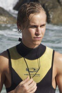
Rhys: So i think the underwear sold me. This is super bold. TO stand in a public place in nothing but your undies. I do wish your eyes were looking at the camera and your shoulders werent hunched but this is a great photo.
Andrew: Whoa! Showing this much skin in the first week Juan? ... hot lol. Other than looking sexy, I don't really feel a connection with you and the city or camera. The city doesnt seem to take a part in your photo... it just feels like its there as a boring backdrop. I wish the background was a bit clearer as the lighting on you makes me feel like you aren't even there. I will compliment your rockin bod... you look great in that little pair of underwear... but thats about it. Good luck!
Eugen: Underwear won't win me over unless the theme calls for it lol I don't mind this though. You do look great in those underwear, but your pose seems uncomfortable, like you wish you weren't in the middle of the street in your underwear. Your expression would be great if you were looking up, even off to the side, but you seem leery of what's going on. Your setting is what wins me over. The buildings, the people, the road you're on. All very city life.
Luke: Ok, I needed to go take a cold shower after seeing this shot. You do realize that Sexy is generally the second week of the game, not the first, right? Ok, I'm going to start off with my negatives, cause I'd rather leave you with my positives at the end. The fact that you're in your underwear for this shoot causes a bit of a disconnect for me when it comes to the theme. While your theme is prevalent in other ways, it's just generally not how you'd see people dressed to go outside. This could have been rectified with a different expression though. Maybe even some context as to why your model would be walking around half-naked. On the plus side, we've had several models submit photos that could be viewed as being candid shots. I doubt anyone will mistake this for being a candid shot. Also, the theme shows through well-enough with your setting. It's not the strongest start you could have had to the competition, but I think it's fine.
Sean: I don't get the connection with the theme at first but it grows on me. I think it's very bold. This would be much better if you look straight at the camera. That body is hot. Definitely a city boy's abs there!!!

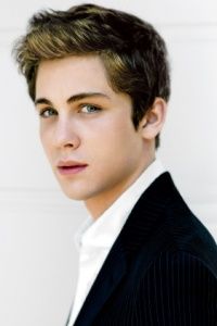
Andrew: I love everything about this photo Logan... except for the face. You need to work a little on facial expressions because your eyes and mouth look very weird here. But other than that, I love the slimming outfit and the Diner backdrop. Very "city" like! From your samples, I would have preferred the other one, but, I thought they both worked very well with this weeks theme. Work on the face and you will be one to be reckoned with Logan. Still, you did a great job this week!
Luke: I had peeked at your Samples thread and while either would have been fine, you chose correctly for me. It'll sound a little hypocritical of me when compared to what I've said about other photos, but I like the fact that this has a bit of a candid feel to it. I guess that's mainly cause it's obvious that it's meant to have that feeling rather than it being a mistake or just actually being candid. I don't know what your level of proficiency is with graphics software, but if you can ever take the text out of a photo, that will always help you. In this case, the text isn't really distracting, but it would have been a nice touch to not have that in there.
Eugen: This is a good choice. The buildings, the diner sign, works wonders. I think you look good and I'm glad you're looking off in the distance because it makes sense with the photo. I also like that you're just putting on your jacket. It all works well together. For me with your eyes, they look a bit baggy but hey, that's city life for you right. lol
Sean: I don't like the size and how the photo looked so thinned and cropped. Other than that, I actually love this photo. I love the model quality in you. I like your style. And it's quite sexy too, especially that neck!!!
Rhys: This is great i was hoping you'd pick this. I totally love your coloring, your look and the city life vibe i get from it.

Eugen: I can see city in the styling and the background, not the blue honeycomb thing but the building behind that. It's not my favourite but definitely not the worst.
Andrew: This is an interesting take on city life. I don't really see anything city in what you are wearing, but the background has somewhat of a city vibe (especially with the "EXIT" sign found in buildings). The vest is a really odd choice of clothing but it does show off your rockin bod. I'm not a fan of the hunched over head and the facial expression is a bit of bore. Like Eugen, it's not the worst, but you could do a lot better. Good luck!
Rhys: knowing your background i knew this may be hard but i like what you had to work with. The exit sign, the chain on your clothing, even your clothing scream city life to me... if the blue background thing wasnt there it would almost look like a city shop getting ready to close down. I'm going to agree with Eugen though it's not my favorite but not the worst
Luke: I once played as Maria Kanellis in the female Cycle and I think you're going to run into the same problem I did when I played that game: your pictures are probably all going to look a bit slutty. Luckily for you, the judges in the Male Cycle don't seem to mind that as much as in the Female Cycle. I don't fully see City Life in your attire as that's something that could blend in at a couple different non-city locales. The background helps and the blue honeycomb doesn't bother me at all. That kind of structure is something I feel you're more likely to find in a city than in a more rural setting (and I've lived extended periods of time both in big cities and out in rural "country" areas). The pose isn't great, but isn't terrible, either. It's kind of a mixed bag with you, but I look forward to seeing what you can produce in the future. I researched your portfolio when you signed up (and no, it wasn't just an excuse to look at porn ) and without having searched much, I know you do have some good shots to potentially use in the future.
First, you're hot. Btw Luke, I also google'd him and my boyfriend found out about that and wondered if I have some kind of fetish to see men on men action. That was so awkward. Back to your photo, yeah that blue thing is really distracting. I like you actually. I can't relate your style to the theme much but I actually like it especially your face.

Andrew: This is fantastic Max! Love the cityscape background... is that NYC i see? Your relaxed pose and cool attire is perfect for the city. If you were looking at the camera it would have been perfect. I also would have liked this to be in colour, but the B&W gives it a gritty texture which is cool too. The rule of thirds works great in this shot as does the slanted angle. Great work this week Max! This is one of my favourites.
Rhys: I'm loving the black and whiteness of the photo. Love the outfit and the overlook of the city but there is something turnoff ish about your facial expression to me.
Luke: While this isn't a stunning photo to me, it is one that I feel is perfect for this shoot. You have captured the essence of an aspect of City Life in this photo. It's a shot that's perfect, yet feels flawed in a good way. Unlike Andrew, I'm a fan of this being in black and white. I like that gritty aspect to the photo.
Eugen: Your expression is about the only thing I don't like, and it's mostly because you're looking over your shoulder and down that's playing on your expression. Other than that, this photo is really good. I love the setting. I love your clothing. Definitely a great start to the game.
Sean: Definitely the best setting this week. I love the black & white effect in this photo. Definitely a city boy here. I can't wait to see your photo next week.

Rhys: I love this. The spray paint on the car makes it very city like and just your pose is perfect. I will say the one think i dont like is the color of the car adn your jacket blending in but overall its a great picture... i actually at the same time do like the coloring... i think the spray paint made it much better
Andrew: This is a really interesting take on the "city life" theme... As much as the bright lights and skyscrapers represent the city... you also have to remember about the less than nice neighbourhoods in the city haha. The graffiti and beat up car are a nice touch. The clothing choices are a bit odd and monochromatic what with all the greys and like Rhys says, it blends into the background. The pose is a little boring, but the creativity behind this photo is what makes it stand out. Good job Robert!
Eugen: Mr. Downey Jr. I'm in love with you lol I love your setting. The graffiti, the car that looks like it was stripped. Your clothes also work. Your pose is nice and the connection with the camera is very good! Great job!
Luke: Honestly, I was wondering how you'd fair in this competition cause you don't really fit the mold of a model that normally does well in this series. However, if this how you start off, to hell with that mold. I love that you took this route and showed a different aspect to City Life that not as many people probably would have thought to go. The pose is a little boring, but at the same time, it's appropriate. I also have no problem with the color of your clothes cause if you wore any bright colors, it would clash with the vibe the photo is trying to give. As far as I'm concerned, you're styled perfectly for this shot.
Sean: I don't like the styling. I think it's very gloomy and you need to work on that. I don't see a model here so your challenge is to convince us judges that we see a model in the photo. Work on that!!!

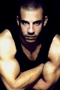
Luke: I'm not really a fan of the angle of your neck in this picture. Your traps are so built that you have to be careful with your angles like that cause you could easily make it look like you don't have a neck at all. That said, you've made it easy to see your connection to the theme this week. It's a little dull and not really memorable, but it's fine overall. I would imagine it's good enough to help you see another round where you'll possibly have a theme that suits you more.
Eugen: The setting is great. Your arms are fantastic *fans self* I do agree with Luke about your neck but while that doesnt' bother me too much, I am hoping that we will see different expressions in the future. I know this is only the first shoot but that is classic Vin Diesel expression. Always bring your arms and you'll win me totally lol (JK i like variety as well as arms)
Andrew: I can feel the city vibe from this Vin. Its a little too generic for me... but its not a terrible shot. Just very bland. You can work on your outfit more and your pose. Not too fond of the head position either. The photo does work for the shoot though so I don't think you will have a problem getting through, but you need to work more on your fashion sense and pose. Good luck!
Sean: Those biceps!!! Just wow!!!. I don't like that you chinned down your face because it make you look shorter but I love how simple and effective this photo is. Nice concept.
Rhys: Great photo. The one thing i dont like is the facial expression but i love the city vibe.
Welcome to your First Elimination session. This week you need to submit a photo to represent the life in the city. Let's see the photos.

Rhys: hm i have very iffy feelings about this. Thanks for the description though. I love your look but i'm not fond of the city background.
Andrew: I actually love this Daniel! Its got a very sophisticated vibe going on. The city life definitely consists of busy office jobs... which are not fun! The B&W i could have done with out, but it does give the shot a cool effect. I do wish you were looking at the camera though as it would help give a better connection with the viewer. Other than those two things, I think you did a fine job with this weeks theme.
Eugen: I'm with Andrew on this one. I love the setting. Late night at work, the city scenery is obvious in the window. You look handsome and hard at work. Good job!!
Luke: Stuck working late? Yeah, that's reads City Life to me. I like how you looked engrossed in your task, but still dignified at the same time. You modeled well in this picture and did an even better job incorporating the theme.
Sean: I love this so much. I think you managed to portray the city life so well. I see a city man in you. Great execution. Even though you don't watch the camera, the connection with us viewers is still strong.

Eugen: The outfit, the briefcase, the styling all definitely say city man to me. I'm not fond of your expression but it's a minor complaint
Andrew: Love love love the outfit! the suit, umbrella, briefcase, and coat... def. a city boy. I do agree with Eugen about the expression... your mouth looks a little odd. lol Your pose on the other hand is great and shows off your slim bod. I wish there was a bit more background other than a white wall, but you really came through with the city look in your accessories. Good Job Eddie!
Rhys: I'm going to agree with Eugen here... your facial expression is a tad strange but i'm digging the outfit. Shows that your a classy business man going to work.
Luke: Despite the studio background, it's still easy to read City Life in this picture. Like the other judges, your face is a bit off-putting in this photo, but it's not terrible. I do really like your styling and accessorizing in this shot.
Sean: Agree with Luke that the background don't affect this photo at all. The styling is so strong. I love the combination of the accessories in this photo so much. Great job.

Andrew: I think this is great Ewan! I see we are back in your older days. Love the hair, the silly expression, and the body language. The motorcycle and buildings/cars all around you really bring out the city atmosphere. The photo is a tad on the blurry side but it's not terrible quality. Also, the B&W makes it feel very old fashioned so I don't know if that works entirely either... but I do like the effect, and the overall set works really well into this weeks theme. It would be nice for there to be no words in the corner, but honestly I don't mind. You took a great shot here Ewan. Good job!
Luke: This shot has grown on me. The facial expression made me have flashbacks to Jack Nicholson in The Shining, but other than that, I love the photo. Great styling, great pose, and great setting. I think that I like that it's in black and white as well. I'm picturing it in color and I feel like the black and white is adding character to the photo in this instance.
Eugen: I like this. The photo is a tad on the grainy side but not enough to bother me. I think the clothing choice is a throwback to the fifties so I think that the old fashion vibe is on purpose. I like your setting a lot. This is really good.
Sean: I got the 'James Dean' vibe from this photo. I love that you have so much fun in this photo. I like the concept. I think you need to be careful more with your expression but overall, I like this
Rhys: I agree with sean on the James Dean Vibe.... totally a great city vibe... one thing i dont like is your mouth it seem very awkward to me.

Andrew: This is a nice pic Grant! San Fran is surely a big city... I don't know if this represents city life though. More of a beach vibe especially with the attire. But, this is a great shot and i love the whole backdrop for what it is. The bridge does represent city in a way... I wish you gave a little description so we could've seen why you may have chosen this one over others. A tad candid but it works in this shot! Good Luck.
Rhys: So i'm a huge Grant Gustin fan and i really think this is a great picture. It's pretty simple but it'll get you through. It does look a tad candid like your best friend took it but i'm still a fan of it.
Eugen: I guess I can see city beach. That is a famous bridge so luckily for you, we know where it is. Your clothes do scream city kid to me so that's a plus. This is pretty good in a way, I don' see candid at all but I do get why the other guys see that. Nice try.
Luke: When it comes to your choice in attire, I'm going to have to side with Eugen on this one: it definitely reads city to me. Also, he was right that it's fortunate that's a famous bridge, so it does help us connect you to a city easier considering this is basically a beach shot. While it doesn't look candid to me, I am able to see why other judges might feel that way. Ya know, now that I've typed this out, I just realized I probably could have just copied and pasted Eugen's critique

Sean: I don't know what to say about this since my fellow judges already said what I want to say. All I can say is I like this. I love the simplicity in this photo. You looked like a very humble city boy here. I don't see a model here but I think you have the potential

Andrew: I don't want to sound harsh here Harry, but this is way too candid and not much modelling at all. The bag and suit fit the theme but I can't overlook the fact that this is a paparazzi shot and it just doesn't work. I know you as a model have a very limited selection, but i'm sure you could have done a lot better than this. You have potential in this competition, so I will keep that in mind when I do my ranking, but you are not off to a good start with this Harry. Good luck!
Rhys: Your face is drawing me in. I feel like your body and outfit fit the theme but everything around it does not. I guess the people could be like people in a city and the steps of a building but i have to try really hard
Luke: Yeah, this definitely looks candid to me. Had there not bee obvious passer-bys in the background, it could have been played off as being a modeling photo that happened to look candid, but the background surely suggests a candid shot. I'm not really a fan of your facial expression or you pose in this shot. The styling is nice and you definitely are in the city, so there are positive aspects of this photo.
Eugen: Yikes, this is candid. The outfit is great and I like the setting but it's not good to submit candid photos unless they can make us believe they are not. You have not done that here sorry.
Sean: Yeah candid is very risky. I think this is your first time here. So next time try to avoid candid shot unless we want you to submit one. I think the styling is definitely city. I love the attitude that you brought here. I hope we get to see you again.

Rhys: I really like you and i'm rooting for you but this photo seems a tad candid. Your face and smile is what catches my but the door is sort of blocking the city background and im trying to figure out whats in your hand.
Andrew: haha I new that was a Guinness the moment I saw it. Love the irish.

I actually really like this shot Jamie! The cab, the suit, even the drink from the bar. I think this has got city boy all over it. The picture is a bit small which I can overlook, but larger would be nice.. it also feels cropped or cramped because the cab door is taking over the shot. lol The little bit of greenery also shows how there isnt much green in the city but there is some! I can see why Rhys sees it as a bit candid but I can see it as a modelling shot as well. Body language is good and the cheeky smirk is perfect. Good job Jamie!
Eugen: Jamie! You have a great advantage over the other guys. You're a model as well as an actor. I actually forgot you were the Sheriff from Once Upon A Time and when I saw your name I was like OH MODEL he's got this! lol
ANYWAY, I also knew that was a Guinness right away too and hey lets be real, it seems like a city beer to me lol I like this. I like the connection with the camera. I like your setting. You're dressed up and drinking beer, so city life imo. Good job!
Luke: I looked and didn't see any photos that were much larger than this one. The largest I found was probably about 15% larger than the one you submitted. Like Andrew, I would have prefered a larger shot to be able to see you better, but this one is fine enough as it is. That said, it's a nice shot. Doesn't feel candid to me, but I am able to see why Rhys feels it may be. I like the pose and the beer in your hand is a nice added touch. I don't think this photo will be memorable, but it's a nice way to start off the competition. It makes me optimistic that you will top your Justin Hartley performance.
Sean: Being a former model, I expected you to do better. This photo is okay. I got the city vibes, but the size should be better next time because it definitely help the opinion towards the photo

Rhys: By far my favorite. The coloring is amazing, the way the lighting reflects to make you stand out and slightly hits the building... gorgeous
Andrew: This is an awesome shot Jay! Very stylish. Concept and location are great. Venice is a beautiful city to shoot in. There are two things that bother me a bit though.. the lighting and the hair. I do wish the lighting was a bit brighter for this theme... its really hard to recognize where you are at first glance. I had no clue you were on a gondola, let alone Venice. lol The wet hair is also a tad unattractive... the way the light hits it makes it greasy looking. I love the suit and the pose though, so great job on that! Good luck!
Eugen: This is nice. I love the setting and the colouring. I'm not bothered by the lighting cuz I do find that my screen seems to be a bit better than most. Photos that look dark to a lot of people are just fine to me. My only issue is your hair, only ONLY because this is the first week and I don't know who you are, I'd love to see more of your face. BUT I love profile shots and you have a GORGEOUS profile!!! Also, great pose. Good job!
Luke: While your color scheme matches the coloring of the background, you still manage to pop out in this photo. I have absolutely no problem with profile shots. I know some people are sticklers for "I want to see your eyes," but profile shots are legitimate can when used in the right situation, much more powerful. This is one of those situations. Overall, definitely really like this photo. Great start to the competition.
Sean: The angle is fantastic. I see a model shot here. I really like the setting as well. You set the bar high for yourself. As for your profile shot, I think you do look perfect here.

Rhys: So i think the underwear sold me. This is super bold. TO stand in a public place in nothing but your undies. I do wish your eyes were looking at the camera and your shoulders werent hunched but this is a great photo.
Andrew: Whoa! Showing this much skin in the first week Juan? ... hot lol. Other than looking sexy, I don't really feel a connection with you and the city or camera. The city doesnt seem to take a part in your photo... it just feels like its there as a boring backdrop. I wish the background was a bit clearer as the lighting on you makes me feel like you aren't even there. I will compliment your rockin bod... you look great in that little pair of underwear... but thats about it. Good luck!
Eugen: Underwear won't win me over unless the theme calls for it lol I don't mind this though. You do look great in those underwear, but your pose seems uncomfortable, like you wish you weren't in the middle of the street in your underwear. Your expression would be great if you were looking up, even off to the side, but you seem leery of what's going on. Your setting is what wins me over. The buildings, the people, the road you're on. All very city life.
Luke: Ok, I needed to go take a cold shower after seeing this shot. You do realize that Sexy is generally the second week of the game, not the first, right? Ok, I'm going to start off with my negatives, cause I'd rather leave you with my positives at the end. The fact that you're in your underwear for this shoot causes a bit of a disconnect for me when it comes to the theme. While your theme is prevalent in other ways, it's just generally not how you'd see people dressed to go outside. This could have been rectified with a different expression though. Maybe even some context as to why your model would be walking around half-naked. On the plus side, we've had several models submit photos that could be viewed as being candid shots. I doubt anyone will mistake this for being a candid shot. Also, the theme shows through well-enough with your setting. It's not the strongest start you could have had to the competition, but I think it's fine.
Sean: I don't get the connection with the theme at first but it grows on me. I think it's very bold. This would be much better if you look straight at the camera. That body is hot. Definitely a city boy's abs there!!!

Andrew: I love everything about this photo Logan... except for the face. You need to work a little on facial expressions because your eyes and mouth look very weird here. But other than that, I love the slimming outfit and the Diner backdrop. Very "city" like! From your samples, I would have preferred the other one, but, I thought they both worked very well with this weeks theme. Work on the face and you will be one to be reckoned with Logan. Still, you did a great job this week!
Luke: I had peeked at your Samples thread and while either would have been fine, you chose correctly for me. It'll sound a little hypocritical of me when compared to what I've said about other photos, but I like the fact that this has a bit of a candid feel to it. I guess that's mainly cause it's obvious that it's meant to have that feeling rather than it being a mistake or just actually being candid. I don't know what your level of proficiency is with graphics software, but if you can ever take the text out of a photo, that will always help you. In this case, the text isn't really distracting, but it would have been a nice touch to not have that in there.
Eugen: This is a good choice. The buildings, the diner sign, works wonders. I think you look good and I'm glad you're looking off in the distance because it makes sense with the photo. I also like that you're just putting on your jacket. It all works well together. For me with your eyes, they look a bit baggy but hey, that's city life for you right. lol
Sean: I don't like the size and how the photo looked so thinned and cropped. Other than that, I actually love this photo. I love the model quality in you. I like your style. And it's quite sexy too, especially that neck!!!
Rhys: This is great i was hoping you'd pick this. I totally love your coloring, your look and the city life vibe i get from it.

Eugen: I can see city in the styling and the background, not the blue honeycomb thing but the building behind that. It's not my favourite but definitely not the worst.
Andrew: This is an interesting take on city life. I don't really see anything city in what you are wearing, but the background has somewhat of a city vibe (especially with the "EXIT" sign found in buildings). The vest is a really odd choice of clothing but it does show off your rockin bod. I'm not a fan of the hunched over head and the facial expression is a bit of bore. Like Eugen, it's not the worst, but you could do a lot better. Good luck!
Rhys: knowing your background i knew this may be hard but i like what you had to work with. The exit sign, the chain on your clothing, even your clothing scream city life to me... if the blue background thing wasnt there it would almost look like a city shop getting ready to close down. I'm going to agree with Eugen though it's not my favorite but not the worst
Luke: I once played as Maria Kanellis in the female Cycle and I think you're going to run into the same problem I did when I played that game: your pictures are probably all going to look a bit slutty. Luckily for you, the judges in the Male Cycle don't seem to mind that as much as in the Female Cycle. I don't fully see City Life in your attire as that's something that could blend in at a couple different non-city locales. The background helps and the blue honeycomb doesn't bother me at all. That kind of structure is something I feel you're more likely to find in a city than in a more rural setting (and I've lived extended periods of time both in big cities and out in rural "country" areas). The pose isn't great, but isn't terrible, either. It's kind of a mixed bag with you, but I look forward to seeing what you can produce in the future. I researched your portfolio when you signed up (and no, it wasn't just an excuse to look at porn
 ) and without having searched much, I know you do have some good shots to potentially use in the future.
 First, you're hot. Btw Luke, I also google'd him and my boyfriend found out about that and wondered if I have some kind of fetish to see men on men action. That was so awkward. Back to your photo, yeah that blue thing is really distracting. I like you actually. I can't relate your style to the theme much but I actually like it especially your face.

Andrew: This is fantastic Max! Love the cityscape background... is that NYC i see? Your relaxed pose and cool attire is perfect for the city. If you were looking at the camera it would have been perfect. I also would have liked this to be in colour, but the B&W gives it a gritty texture which is cool too. The rule of thirds works great in this shot as does the slanted angle. Great work this week Max! This is one of my favourites.
Rhys: I'm loving the black and whiteness of the photo. Love the outfit and the overlook of the city but there is something turnoff ish about your facial expression to me.
Luke: While this isn't a stunning photo to me, it is one that I feel is perfect for this shoot. You have captured the essence of an aspect of City Life in this photo. It's a shot that's perfect, yet feels flawed in a good way. Unlike Andrew, I'm a fan of this being in black and white. I like that gritty aspect to the photo.
Eugen: Your expression is about the only thing I don't like, and it's mostly because you're looking over your shoulder and down that's playing on your expression. Other than that, this photo is really good. I love the setting. I love your clothing. Definitely a great start to the game.
Sean: Definitely the best setting this week. I love the black & white effect in this photo. Definitely a city boy here. I can't wait to see your photo next week.

Rhys: I love this. The spray paint on the car makes it very city like and just your pose is perfect. I will say the one think i dont like is the color of the car adn your jacket blending in but overall its a great picture... i actually at the same time do like the coloring... i think the spray paint made it much better
Andrew: This is a really interesting take on the "city life" theme... As much as the bright lights and skyscrapers represent the city... you also have to remember about the less than nice neighbourhoods in the city haha. The graffiti and beat up car are a nice touch. The clothing choices are a bit odd and monochromatic what with all the greys and like Rhys says, it blends into the background. The pose is a little boring, but the creativity behind this photo is what makes it stand out. Good job Robert!
Eugen: Mr. Downey Jr. I'm in love with you lol I love your setting. The graffiti, the car that looks like it was stripped. Your clothes also work. Your pose is nice and the connection with the camera is very good! Great job!
Luke: Honestly, I was wondering how you'd fair in this competition cause you don't really fit the mold of a model that normally does well in this series. However, if this how you start off, to hell with that mold. I love that you took this route and showed a different aspect to City Life that not as many people probably would have thought to go. The pose is a little boring, but at the same time, it's appropriate. I also have no problem with the color of your clothes cause if you wore any bright colors, it would clash with the vibe the photo is trying to give. As far as I'm concerned, you're styled perfectly for this shot.
Sean: I don't like the styling. I think it's very gloomy and you need to work on that. I don't see a model here so your challenge is to convince us judges that we see a model in the photo. Work on that!!!

Luke: I'm not really a fan of the angle of your neck in this picture. Your traps are so built that you have to be careful with your angles like that cause you could easily make it look like you don't have a neck at all. That said, you've made it easy to see your connection to the theme this week. It's a little dull and not really memorable, but it's fine overall. I would imagine it's good enough to help you see another round where you'll possibly have a theme that suits you more.
Eugen: The setting is great. Your arms are fantastic *fans self* I do agree with Luke about your neck but while that doesnt' bother me too much, I am hoping that we will see different expressions in the future. I know this is only the first shoot but that is classic Vin Diesel expression. Always bring your arms and you'll win me totally lol (JK i like variety as well as arms)
Andrew: I can feel the city vibe from this Vin. Its a little too generic for me... but its not a terrible shot. Just very bland. You can work on your outfit more and your pose. Not too fond of the head position either. The photo does work for the shoot though so I don't think you will have a problem getting through, but you need to work more on your fashion sense and pose. Good luck!
Sean: Those biceps!!! Just wow!!!. I don't like that you chinned down your face because it make you look shorter but I love how simple and effective this photo is. Nice concept.
Rhys: Great photo. The one thing i dont like is the facial expression but i love the city vibe.


